com.codename1.ui.package.html Maven / Gradle / Ivy
Main widget package containing the component/container "composite" similar
both in terminology and design to Swing/AWT.
Component/Container Relationship
Containers can be nested one within the other to form elaborate UI's. Containers use
{@link com.codename1.ui.layouts} to arrange the components within. This is important
as it allows a container can adapt to changing resolution, DPI, orientation, font size etc.
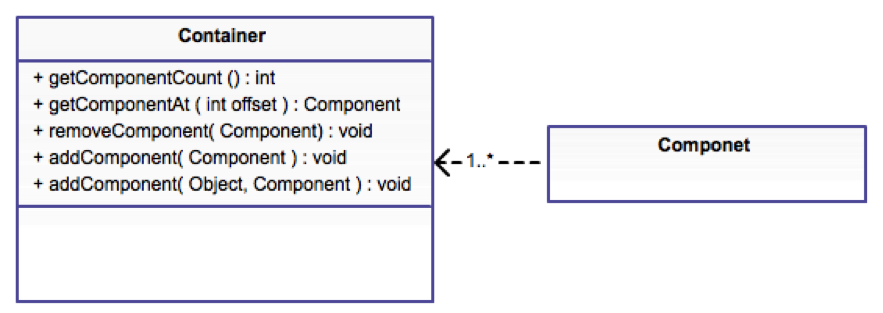
A container doesn't implicitly reflow its elements and in that regard follows the direction of AWT/Swing. As
a result the layout can be animated to create a flowing effect for UI changes. This also provides improved
performance as a bonus. See this sample of {@code Container} animation:
You can learn more about layout managers {@link com.codename1.ui.layouts here} and about
event handling {@link com.codename1.ui.events here}.
Component Gallery
The component gallery below isn't complete or exhaustive but it should give you a sense of the
types of widgets available within Codename One in a glance.
AutoCompleteTextField
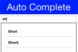 {@link com.codename1.ui.AutoCompleteTextField} provides suggestions as you type into the text field
BrowserComponent
 {@link com.codename1.ui.BrowserComponent} allows us to embed an OS native browser into the app and connect to its JavaScript runtime!
Calendar
 {@link com.codename1.ui.Calendar} presents a visual date picker. Notice that we recommend using the
{@link com.codename1.ui.spinner.Picker} class which is superior when running on the device for most use cases.
CheckBox
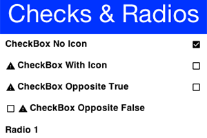 {@link com.codename1.ui.CheckBox} provides a check flag to tick on/off.
{@link com.codename1.ui.RadioButton} provides an exclusive check marking that only applies to one radio within the group.
Both can also appear as toggle buttons
ComboBox
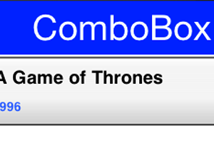 {@link com.codename1.ui.ComboBox} is a list with a single visible entry that can popup the full list. Notice that we recommend using the
{@link com.codename1.ui.spinner.Picker} class which is superior when running on the device for most use cases
Command
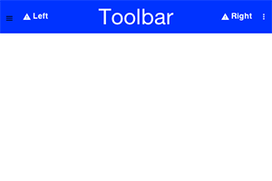 {@link com.codename1.ui.Command} & {@link com.codename1.ui.Toolbar} provide deep customization
of the title area and allow us to place elements in the side menu (hamburger), overflow menu etc.
ComponentGroup
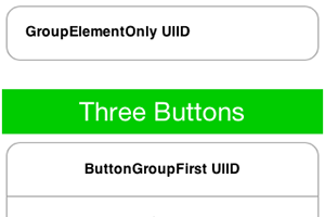 {@link com.codename1.ui.ComponentGroup} allows us to group components together in a a group and manipulate
their UIID's.
InfiniteContainer
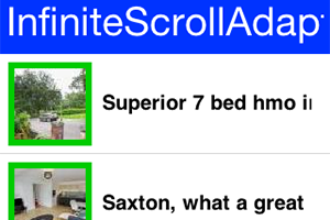 {@link com.codename1.ui.InfiniteContainer} & {@link com.codename1.components.InfiniteScrollAdapter}
implement a {@link com.codename1.ui.Container} that can dynamically fetch more data
List
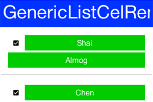 {@link com.codename1.ui.List} a list of items, this is a rather elaborate component to work with! We often
recommend just using {@link com.codename1.ui.Container}, {@link com.codename1.ui.InfiniteContainer} or
{@link com.codename1.components.InfiniteScrollAdapter}
MultiList
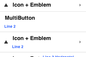
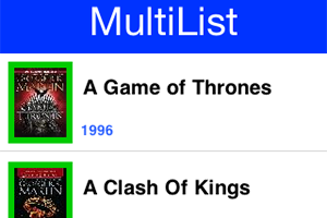 {@link com.codename1.ui.list.MultiList} a list that is a bit simpler to work with than List {@link com.codename1.ui.List} although
our recommendation to use something else still applies
Slider
 {@link com.codename1.ui.Slider} allows us to indicate progress or allows the user to drag a bar to indicate
volume (as in quantity)
SwipeableContainer
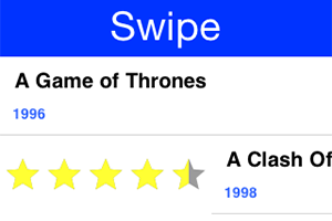 {@link com.codename1.ui.SwipeableContainer} enables side swipe gesture to expose additional functionality
Tabs
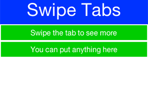
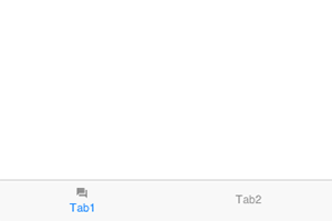 {@link com.codename1.ui.Tabs} places components/containers into tabbable entries, allows swiping
between choices thru touch
TextArea/Field
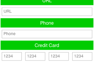 {@link com.codename1.ui.TextArea} & {@link com.codename1.ui.TextField} allow for user input via
the keyboard (virtual or otherwise)
TextComponent
 {@link com.codename1.ui.TextComponent} & {@link com.codename1.ui.PickerComponent} wrap the text field and picker respectively and adapt them better to iOS/Android conventions
ChartComponent
 {@link com.codename1.charts.ChartComponent} can embed a wide range of visualization aids and animations into your app
InfiniteProgress
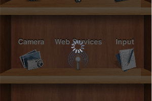 {@link com.codename1.components.InfiniteProgress} provides a constantly spinning component
InteractionDialog
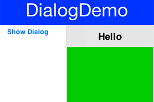 {@link com.codename1.components.InteractionDialog} an "always on top" {@link com.codename1.ui.Dialog}
MediaPlayer
 {@link com.codename1.components.MediaPlayer} allows playing media including video coupled with the
{@link com.codename1.media.MediaManager}
OnOffSwitch
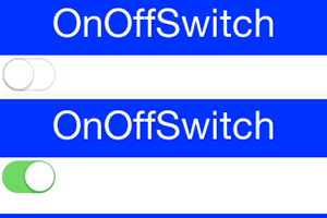 {@link com.codename1.components.OnOffSwitch} allows us to toggle a state similar to the {@link com.codename1.ui.CheckBox}
but with a more modern look
ShareButton
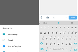 {@link com.codename1.components.ShareButton} provides native "social share" functionality
Picker (Date)
 {@link com.codename1.ui.spinner.Picker} allows us to show an OS native picker UI (Date Picker)
Picker (Time)
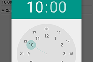 {@link com.codename1.ui.spinner.Picker} allows us to show an OS native picker UI (Time Picker)
ToastBar
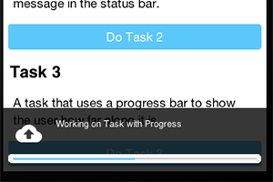 {@link com.codename1.components.ToastBar} shows a non-obtrusive notice on the bottom of the {@code Form}
SignatureComponent
 {@link com.codename1.components.SignatureComponent} shows a dialog that allows the user to "sign" using the touch screen
