scripts.node_modules.bootstrap-input-spinner.README.md Maven / Gradle / Ivy
# bootstrap-input-spinner
A Bootstrap 4 / jQuery plugin to create input spinner elements for number input.
**[Demo page with examples](http://shaack.com/projekte/bootstrap-input-spinner/)**
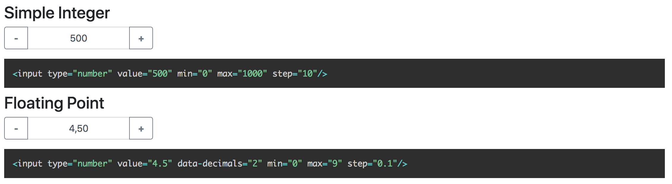
*Screenshot with floating point example and german localization.*
## Features
The Bootstrap 4 InputSpinner
- is **mobile friendly** and **responsive**,
- automatically changes the value when **holding a button**,
- has **internationalized** number formatting,
- allows setting a **prefix** or a **suffix** text in the input,
- handles **`val()`** like the native element,
- **dynamically handles** changing **attribute values** like `disabled` or `class`,
- dispatches **`change`** and **`input`** **events on value change** like the native element and
- works **without extra css**, only bootstrap 4 is needed.
## Installation
```bash
npm install bootstrap-input-spinner
```
Or just download the GitHub repository and include `src/bootstrap-input-spinner.js`.
## Usage
### HTML
Create the element in HTML. The attributes are compatible to the native `input[type="number"]` element.
```html
```
### Script
It is a jQuery plugin.
So, enable the InputSpinner for all inputs with `type='number'` with the following script.
```html
```
Thats it. **No extra css needed**, just Bootstrap 4 and jQuery.
## Syntax and configuration
### HTML
```html
```
Use these attributes to configure the behaviour
- `value` // starting value on element creation
- `min` // minimum value when stepping
- `max` // maximum value when stepping
- `step` // step size
- `inputmode` // the "inputmode" of the input, defaults to "decimal" (shows decimal keyboard on touch devices)
- `data-decimals` // shown decimal places
- `data-digit-grouping` // "false" to disable grouping (thousands separator), default is "true"
- `data-prefix` // show a prefix text in the input element
- `data-suffix` // show a suffix text in the input element
The InputSpinner also handles the standard input attributes `required`, `disabled`, `readonly` and `placeholder`.
### JavaScript
Use JavaScript to create the instance as a jQuery plugin. You may provide additional
configuration in an object as a config parameter.
```javascript
$(element).inputSpinner(config);
```
#### Configuration
The default configuration is
```javascript
var props = {
decrementButton: "−", // button text
incrementButton: "+", // ..
groupClass: "", // css class of the resulting input-group
buttonsClass: "btn-outline-secondary",
buttonsWidth: "2.5rem",
textAlign: "center", // alignment of the entered number
autoDelay: 500, // ms threshold before auto value change
autoInterval: 50, // speed of auto value change
buttonsOnly: false, // set this `true` to disable the possibility to enter or paste the number via keyboard
keyboardStepping: true, // set this to `false` to disallow the use of the up and down arrow keys to step
locale: navigator.language, // the locale, per default detected automatically from the browser
template: // the template of the input
'' +
'' +
'' +
'' +
''
}
```
##### decrementButton, incrementButton
HTML of the texts inside the buttons.
##### groupClass
Additional css class for the `input-group`, results in
```html
```
##### buttonsClass
The css class of the buttons. Use it to style
the increment and decrement buttons as described [here](https://getbootstrap.com/docs/4.0/components/buttons/).
Maybe `buttonsClass: btn-primary` or `btn-success` or whatever type of buttons you want.
##### buttonsWidth
The width of the increment and decrement buttons.
##### textAlign
The text alignment inside the ``
##### autoDelay
The delay in ms after which the input automatically changes the value, when holding the increment or decrement button.
##### autoInterval
Speed of the value change when holding the button in ms. A lower value makes it faster.
##### buttonsOnly
In `buttonsOnly` mode (set `true`) no direct text input is allowed, the text-input
gets the attribute `readonly`. But the plus and minus buttons still allow to change the value.
##### keyboardStepping
In `keyboardStepping` mode (set `true`) allows the use of the up/down arrow keys to increase/decrease the number by the step.
##### locale
Used to format the number in the UI. Detected automatically from the users browser, can be set to "de", "en",… or "de_DE", "en_GB",….
### Programmatic change and read of value
To change or read the value just use the jQuery `val()` function
on the input, like this
```javascript
var currentValue = $(element).val() // read
$(element).val(newValue) // write
```
> **Hint:** Reading the value in vanilla JS with `element.value` will also work, but to set the value you have to use `element.setValue(newValue)` or `$(element).val(newValue)`
### Handling attributes
The attributes
`min`, `max`, `step`, `decimals`, `placeholder`, `required`, `disabled`, `readonly` and `class`
are handled dynamically. The `class` attribute value is dynamically copied to the input element.
#### Sizing
If the original elements class is set to `form-control-sm` of `form-control-lg` the class of the resulting input-group is
dynamically set to `input-group-sm` or `input-group-lg`.
### Events
The InputSpinner handles `input` and `change` events like the native element.
#### Event handling with vanilla JavaScript
```javascript
element.addEventListener("change", function(event) {
newValue = this.value
})
```
#### Event handling with jQuery syntax
```javascript
$(element).on("change", function (event) {
newValue = $(this).val()
})
```
### Methods
Methods are passed as string values instead of the options object.
#### destroy
Removes the InputSpinner and shows the original input element.
```javascript
$(element).inputSpinner("destroy")
```
## Minified version
I don't provide a minified version because I think it should be up to the using programmer
to create minified versions, with all the used script sources concatenated to one file.
But, if you want it, it is easy to create your minified version with uglify: https://www.npmjs.com/package/uglify-js
Just install uglify
```bash
npm install uglify-js -g
```
and then in the src-folder
```bash
uglifyjs bootstrap-input-spinner.js --compress --mangle > bootstrap-input-spinner.min.js
```
Violà! :)
## Browser support
The spinner works in all modern browsers and in the Internet Explorer. Not tested with IE < 11.
For older browsers (IE 9 or so), that doesn't support `Intl`, when you get an error message like
**"Intl is not defined"** (See [issue #34](https://github.com/shaack/bootstrap-input-spinner/issues/34)),
just use a shim or polyfill like [Intl.js](https://github.com/andyearnshaw/Intl.js), and it works.
# Our further Bootstrap and HTML extensions
If you like this component, you may want to check out our other Bootstrap and HTML extensions
[**bootstrap-show-modal**](https://shaack.com/en/open-source-components),
[**bootstrap-detect-breakpoint**](https://shaack.com/en/open-source-components),
[**auto-resize-textarea**](https://shaack.com/en/open-source-components) and
[**external-links-blank**](https://shaack.com/en/open-source-components).
© 2015 - 2025 Weber Informatics LLC | Privacy Policy