combo-boxpackage.README.md Maven / Gradle / Ivy
Go to download
Show more of this group Show more artifacts with this name
Show all versions of vaadin-webcomponents Show documentation
Show all versions of vaadin-webcomponents Show documentation
Mvnpm composite: Vaadin webcomponents
The newest version!
# @vaadin/combo-box
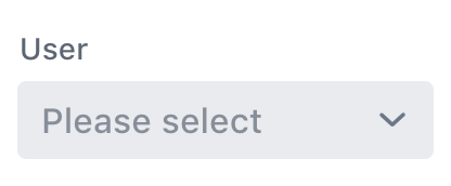
A web component for choosing a value from a filterable list of options presented in an overlay.
[Documentation + Live Demo ↗](https://vaadin.com/docs/latest/components/combo-box)
[](https://www.npmjs.com/package/@vaadin/combo-box)
```html
 ](https://vaadin.com/docs/latest/components/combo-box)
## Installation
Install the component:
```sh
npm i @vaadin/combo-box
```
Once installed, import the component in your application:
```js
import '@vaadin/combo-box';
```
## Themes
Vaadin components come with two built-in [themes](https://vaadin.com/docs/latest/styling), Lumo and Material.
The [main entrypoint](https://github.com/vaadin/web-components/blob/main/packages/combo-box/vaadin-combo-box.js) of the package uses the Lumo theme.
To use the Material theme, import the component from the `theme/material` folder:
```js
import '@vaadin/combo-box/theme/material/vaadin-combo-box.js';
```
You can also import the Lumo version of the component explicitly:
```js
import '@vaadin/combo-box/theme/lumo/vaadin-combo-box.js';
```
Finally, you can import the un-themed component from the `src` folder to get a minimal starting point:
```js
import '@vaadin/combo-box/src/vaadin-combo-box.js';
```
## Contributing
Read the [contributing guide](https://vaadin.com/docs/latest/contributing) to learn about our development process, how to propose bugfixes and improvements, and how to test your changes to Vaadin components.
## License
Apache License 2.0
Vaadin collects usage statistics at development time to improve this product.
For details and to opt-out, see https://github.com/vaadin/vaadin-usage-statistics.
